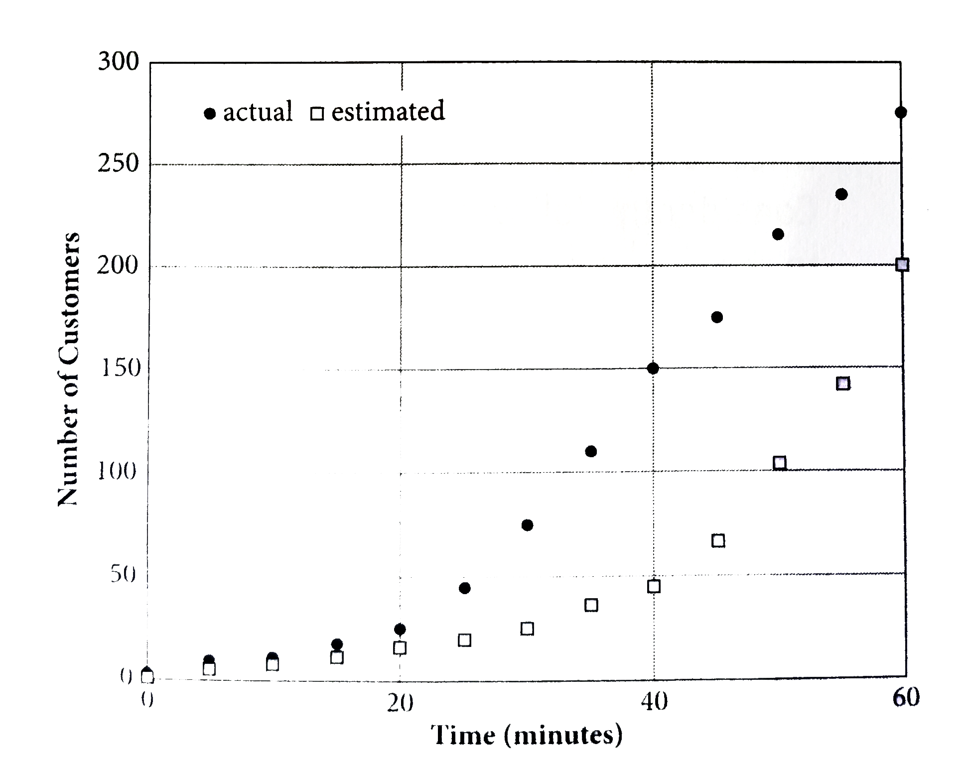
The scatterplot above shows the actual and estimated number of customers visiting a new shopping plaza within the first hour of opening. Which of the following statements correctly compares the rates of incresase for the actual and estimated numbers of customers ?
The rate of increases for the actual number of customeers is greater than that of the estimated number is grater than that of the estimatted number in every 20-minute interval.
The rate of increase for the actual number of customers is less than that of the estimated number in every 20-minute interval.
The rate of incrases for the acutal number of customers is greater than that of the estimated number in the interval from 20 to 40 minutes and less in the interval 40 to 60 minutes.
The rate of increase for the actual number of customers is less than that of the estimated number in the interval from 20 to 40 minutes and greater in the interval 40 to 60 minutes.
The correct Answer is:C
For every 20 minute interval, draw a line of best fit through the data for the actual number of costomeers and similarly for the estimated number of costomers. Then compare the slopes of the lines of best fit for actual and estimated for each 20-minutte interval to compare the rates of increase.
In the interval from 0 to 20 minutes, the slope of the line of best fit for the actual number of costomers is slightly greater (steeper) than that of the estimated model. In the interval from 20 to 40 minutes, the slope of the line of best fit fot the actual data is greater than that of the estimated data. In the interval from 40 to 60 minutes, the slope of the line of best fit for the actual data is less than that of the estimated data. Thus, (C ) is correct.
Topper's Solved these Questions
- SCATTERPLOTSBOOK - KAPLANCHAPTER - SCATTERPLOTSEXERCISE - LINE OF BEST FIT
1 Video
- SCATTERPLOTSBOOK - KAPLANCHAPTER - SCATTERPLOTSEXERCISE - SCATTERPLOT MODELING
1 Video
- SCATTERPLOTSBOOK - KAPLANCHAPTER - SCATTERPLOTSEXERCISE - SCATTERPLOT MODELING
1 Video
- SAT MATH: TIMING ANS SECTION MANAGEMENT STRATEGIESBOOK - KAPLANCHAPTER - SAT MATH: TIMING ANS SECTION MANAGEMENT STRATEGIESEXERCISE - TRY ON YOU OWN
5 Videos
- SYSTEMS OF LINEAR EQUATIONSBOOK - KAPLANCHAPTER - SYSTEMS OF LINEAR EQUATIONSEXERCISE - NUMBER OF POSSIBLE SOLUTIONS
1 Video
Similar Questions
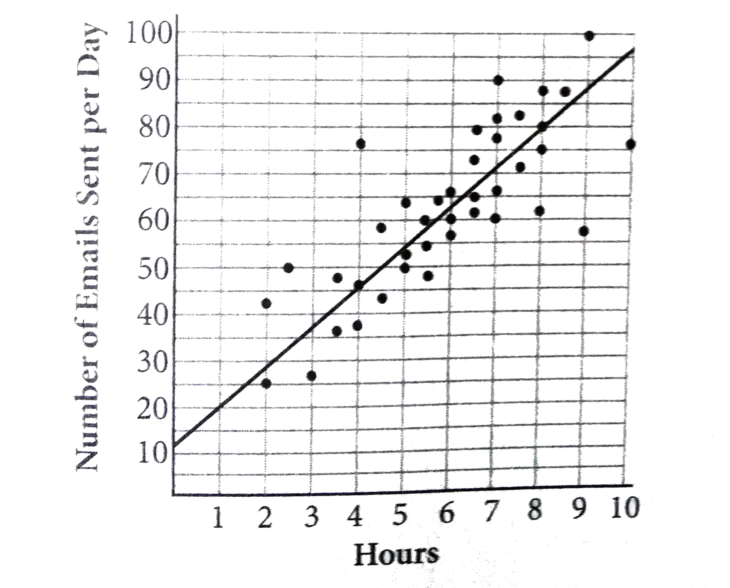
The figure above shows the number of emails sent per day plotted against the number of hours an adult works on a computer per day. Which of the following best estimates the average rate of change in the number of emails sent compared to the number of hours working on a computer?
View Solution
The table above shows two lists of numbers. Which of the following is a true statement comparing list A and list B ?
View Solution
Knowledge Check
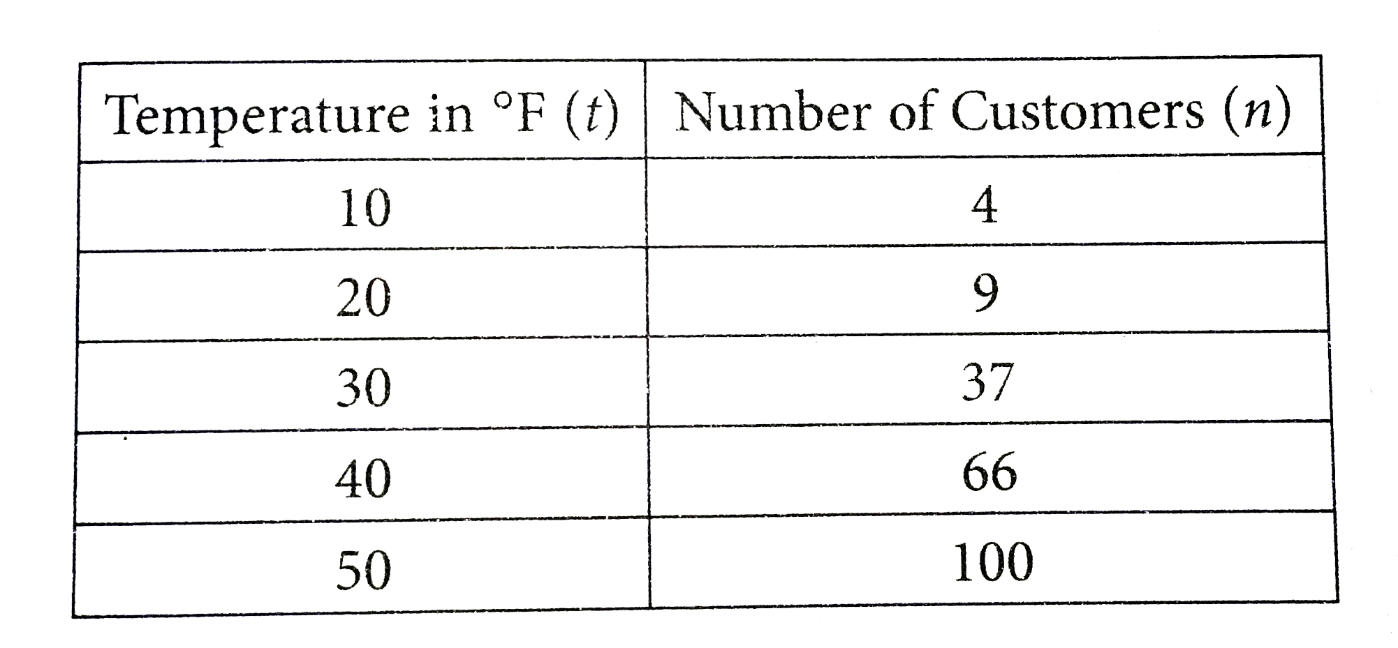
A coffee shop noticed that the outside temperature affected the number of customers who came to the shop that day, as shown in the table above. Which of the following graphs best represents the relationship between the outside temperature t, and the number of customers,n, as indicated by the table?A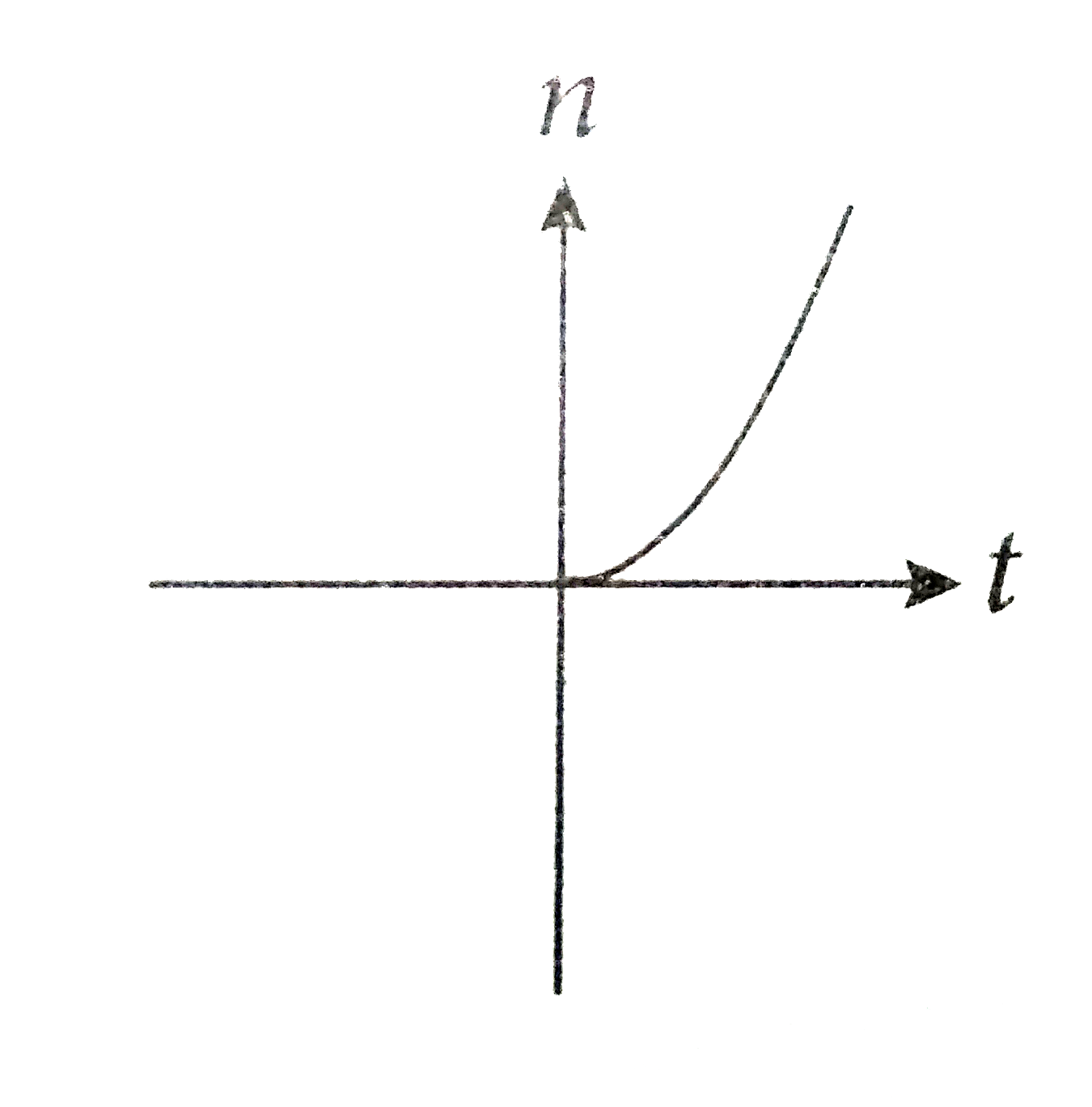 B
B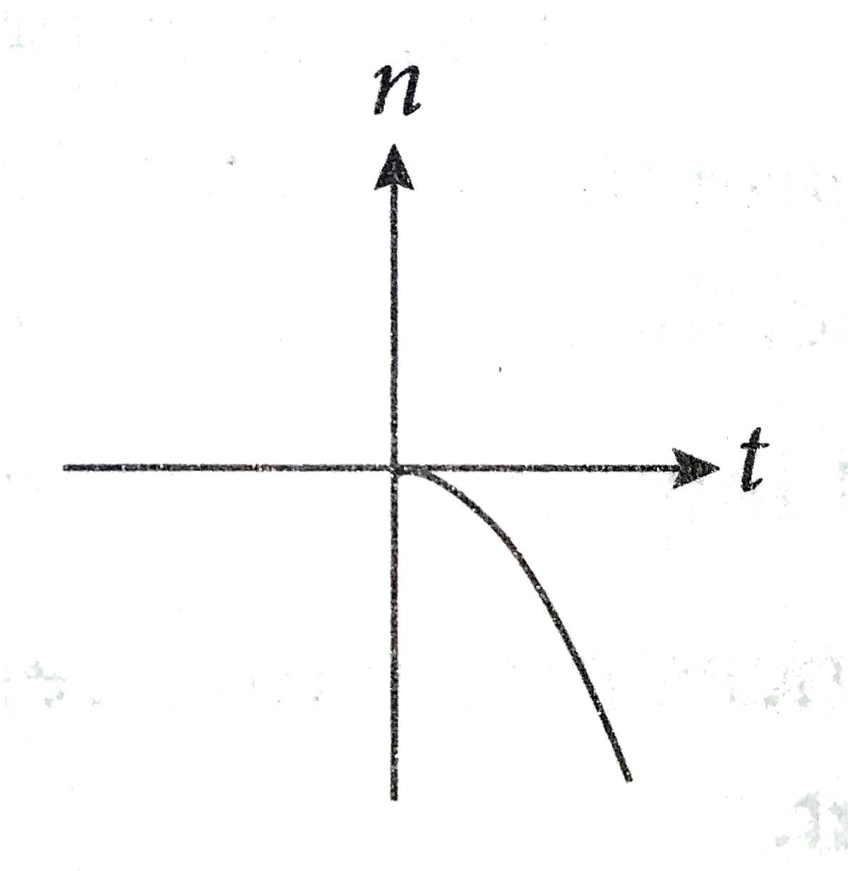 C
C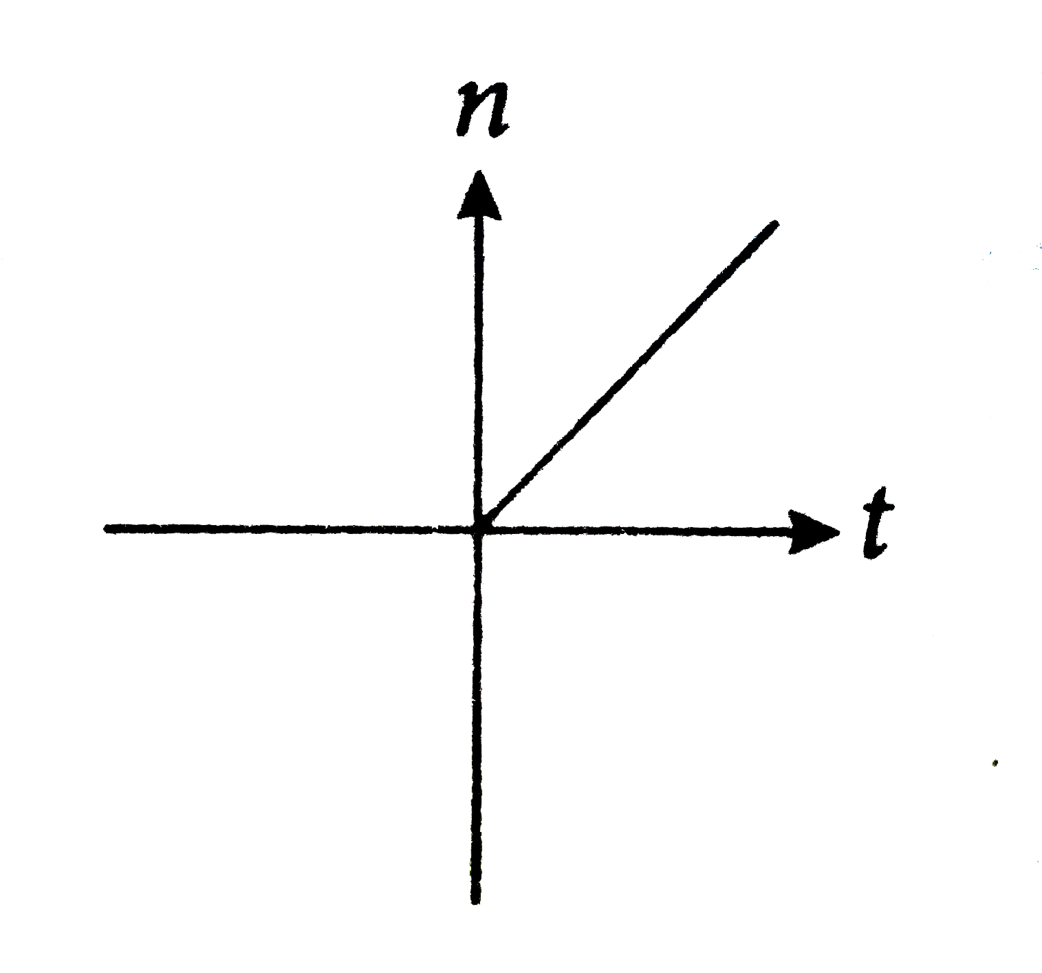 D
D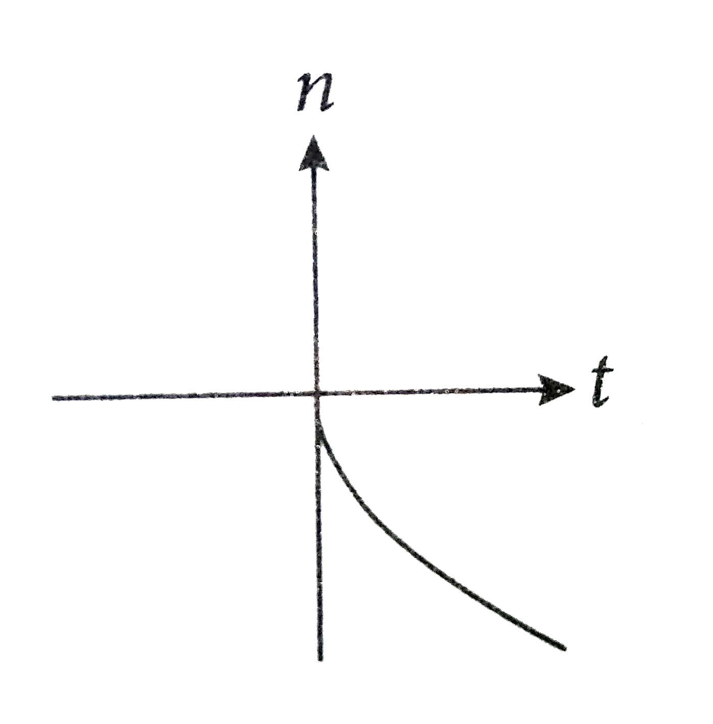
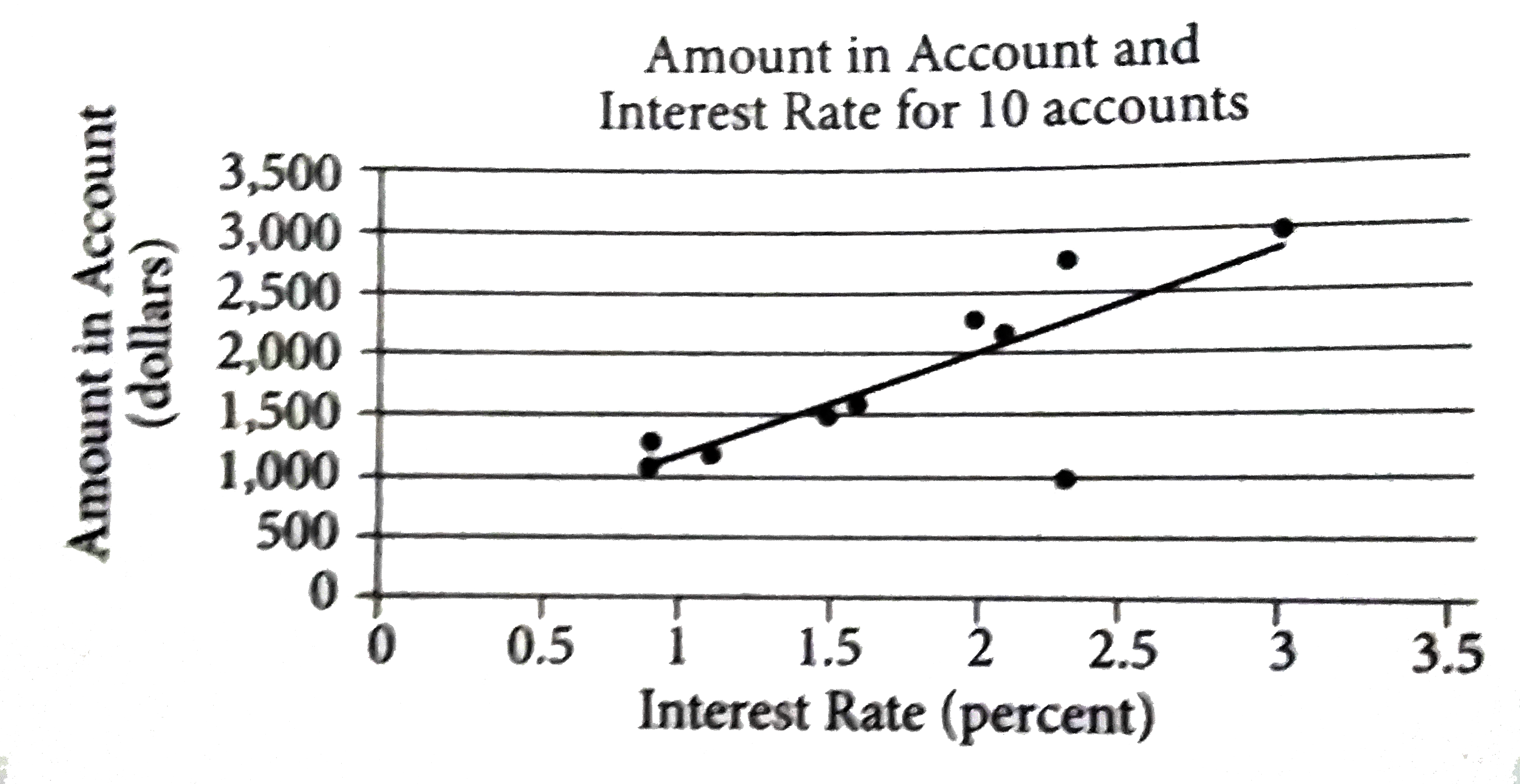
The scatterplot above shows data for ten accounts opened by a company , along with the line of best fit. For the account that contains the least amount of money, which of the following is closest to the difference of the actual amount and the amount predicted by the line of best fit?A200B500C900D1200A bricklayer uses the formula n = 7 l h to estimate the number of bricks, n, needed to build a wall that is l feet long and h feet high. Which of the following correctly expresses l in terms of n and h ?
Al=7nhBl=h7nCl=n7hDl=n7+h
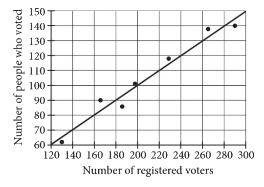
The scatterplot above shows the number of registered voters, x, and the number of people who voted in the last election, y, for seven districts in a town. A line of best fit for the data is also shown. Which of the following could be the equation of the line of best fit?
View Solution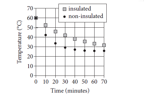
Two samples of water of equal mass are heated to 60 degrees Celsius (°C). One sample is poured into an insulated container, and the other sample is poured into a non-insulated container. The samples are then left for 70 minutes to cool in a room having a temperature of 25°C. The graph above shows the temperature of each sample at 10-minute intervals. Which of the following statements correctly compares the average rates at which the temperatures of the two samples change?
View Solution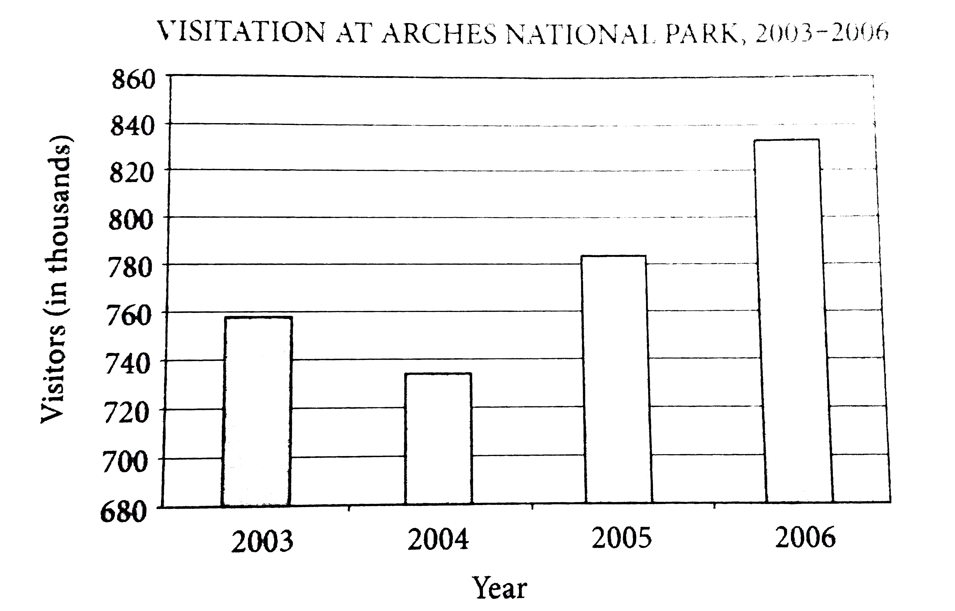
The chart above shows the number of visits, in thousands, at Arches National park for the years 2003 to 2006. Which of the following is the closest approximation of the percent increase in the number of visits from 2004 to 2006?
View Solution(##KPL_SAT_PRD_PLS_C09_E01_001_Q01.png" width="80%">
The scatterplot shows the prevalence of obesity plotted against the prevalence of diabetes in various ares of the United States. Which of the following best estimates the average rate of change in the prevalence of diabetes as comared to the prevalence of obesity ?
View Solution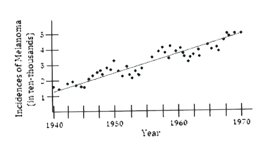
The scatterplot above shows the number of people diagnosed with melanoma, in ten-thousands, from 1940 to 1970. Based on the line of best fit to the data, as shown in the figure, which of the following values is closest to the average yearly increase in the number of incidences of melanoma?
View Solution

