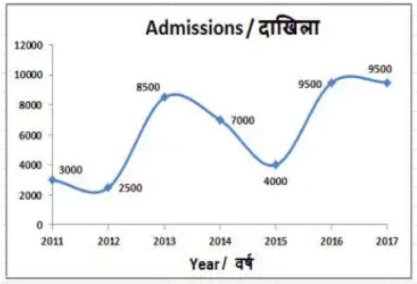
The line graph shows the number of students admitted in the given year to a certain university. Study the diagram and answer the following questions.

In which year were admissions greater that that of the previous years ?
2013
2012
2015
2014
The correct Answer is:A
Step by step video solution for The line graph shows the number of students admitted in the given year to a certain university. Study the diagram and answer the following questions. In which year were admissions greater that that of the previous years ? by Maths experts to help you in doubts & scoring excellent marks in Class 14 exams.
Updated on:21/07/2023समान प्रश्न
The inequation that best describes the graph given below is _________
View SolutionThe inequation that best describes the following graph is _________
View SolutionWhich inequations represent the shaded region in the given figure
View SolutionWhich of the following statement is not correc for following straight line graph :-
ltimg src="https://d10lpgp6xz60nq.cloudfront.net/physics_images/ALN_PHY_R04_E01_015_Q01.png" width="80%"gt
View SolutionWhich of the following statement is not correct for following straight line graph :-
ltimg src="https://d10lpgp6xz60nq.cloudfront.net/physics_images/ALN_PHY_R04_E01_015_Q01.png" width="80%"gt
View Solution'A' is the portion of adenophypophysis which secrets different hormones 'A' is____
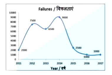
View SolutionThe line graph shows the number of students of a certain university who failed in the given year in their final exams. Study the diagram and answer the following questions

In which year were failures greater than that of the previous year?
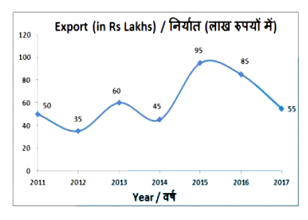
View SolutionThe line graph shows the exprots by a certain company. Study the diagram and answer the following questions.

In which year were the exports greater than that of the previous year?
View Solution
