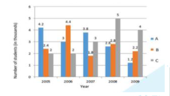
The following graph below shows the number of students (in thousands) who were admitted to three different courses in 5 years in a university. Study the graph and answer the question.

What is the ratio of the number of students who were admitted to course A in the year 2007 to that of students who were admitted to course C in the year 2009?
920
2120
2320
1920
The correct Answer is:D
Step by step video solution for The following graph below shows the number of students (in thousands) who were admitted to three different courses in 5 years in a university. Study the graph and answer the question. What is the ratio of the number of students who were admitted to course A in the year 2007 to that of students who were admitted to course C in the year 2009? by Maths experts to help you in doubts & scoring excellent marks in Class 14 exams.
Updated on:21/07/2023Similar Questions
Study the following graph carefully What is the average number of students who opted for course A in the years 2010, 2011 and 2012?
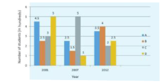
View SolutionThe following bar graph shows the number of students (in hundreds) who have opted for different courses A, B, C and D in 3 years in a college. Study the graph and answer the question.

In the year 2007, the average number of students across the four courses is (in hundreds):
View SolutionThe bar graph shows the number of students (in hundreds) admitted and passed out per year in a college during the years 2010 to 2014. Study the bar graph and answer the question. The ratio of the number of students admitted in the year 2012 to the average number of students passed out inthe years 2013 and 2014 is
View SolutionThe line graph shows the number of students of a certain university who passed in the given year in their final exams. Study the diagram and answer the following questions. In which year were number of students who passed were more than those who passed in the previous year?
View SolutionThe line graph shows the number of students of a certain university who passed in the given year in their final exams. Study the diagram and answer the following questions. What was the difference in the number of students who passed between the years 2013 and 2016?
View SolutionThe line graph shows the number of students of a certain university who passed in the given year in their final exams. Study the diagram and answer the following questions. Number of students who passed in 2016 were greater than that in 2017 by ________.
View SolutionThe line graph shows the number of students admitted in the given year to a certain university. Study the diagram and answer the following questions. In which year were admissions greater that that of the previous years ?
View Solution
